How to Choose Metrics for a SaaS Subscription Dashboard [2026 Guide]
![How to Choose Metrics for a SaaS Subscription Dashboard [2026 Guide]](https://techchannelmea.com/wp-content/uploads/2026/07/how-to-choose-metrics-for-a-saas-subscription-dashboard-2026-guide.png)
You sit down with your morning coffee, open your company’s dashboard, and instead of clarity, you see a mess of charts spinning in every direction. Maybe your support lead is confused about a sudden churn spike, or the product manager is asking for numbers she can’t trust, or you’re facing a board presentation and you’re not even sure which MRR figure to use. This isn’t just you. Nearly everyone in SaaS runs into metric overload at some point, where too many numbers and unclear definitions slow down real decisions. But you can cut through the clutter and build dashboards that actually help people act faster and smarter. The trick is to start with the decisions you want to make—not just with whatever data you can pull.
Start With the Decision, Not the Data Warehouse
A lot of SaaS dashboards begin with the best intentions and a long list of available data. It’s easy to think that showing every number possible gives you more control. In practice, dashboards built this way quickly get crowded, confusing, and ignored. You end up with pages of charts that never lead to action, and teams who stop believing the numbers.
The better move is to flip the process. Before you pick a single metric, ask yourself, “What decision will this dashboard actually help someone make?” For example, an operator needs to know if today’s support volume demands escalation, while a board member cares if net revenue retention is on target for the quarter. When you build around these decisions, every metric must prove its value.
This approach makes you ruthless about what belongs. If a metric doesn’t trigger a real action or choice, it doesn’t belong on the dashboard. Cutting noise keeps everyone focused on numbers that push the business forward.
Tailor Metrics to Roles and Timing
One of the simplest ways to keep dashboards useful is to split them up by user and review cadence. The three-level model—operator, executive, board/investor—has become standard for SaaS teams. Each level has its own purpose, review rhythm, and core questions.
Operator dashboards are for daily use. Think support managers scanning for ticket spikes, or DevOps watching incident trends. These dashboards highlight urgent shifts so front-line teams can react quickly. Executive dashboards are usually checked weekly. Department heads use them to spot changes in MRR, churn, or customer health before problems get too big. Board and investor dashboards, on the other hand, are for monthly or quarterly reviews, zooming out to focus on big-picture trends like retention, growth, and long-term returns.
Keeping these layers separate avoids the “one dashboard fits all” trap. Each team gets only the numbers they truly need, at the moment they need them. That kind of focus doesn’t just reduce confusion—it gives people a reason to use the dashboard every time.
Choose KPIs for Action, Impact, and Clarity

SaaS teams can spend hours debating which KPIs to track. Instead of endless arguments, run every candidate metric through three questions: Will it lead to a concrete action? Does it affect your main goals like revenue, retention, or efficiency? Is it defined so clearly that everyone agrees on what it means?
If a metric won’t prompt anyone to do something differently, it’s just noise. If it doesn’t tie directly to your company’s targets, it’s probably a distraction. And if there’s any confusion about how it’s calculated, you’ll lose trust fast.
After applying these filters, most dashboards only need three to five KPIs per view. Place the most important one in the top-left—this is the number everyone should see first. The rest can fill out the row. This makes dashboards simple to scan and keeps priorities obvious.
Still torn between two metrics? Ask yourself: if one of them suddenly jumped or dropped, which would force you to act? That’s usually the one to keep.
Use Reliable Data Sources and Clear Definitions
Dashboards quickly fall apart when teams use inconsistent data sources or fuzzy definitions. Maybe one group pulls MRR from billing exports, while another uses the general ledger, and suddenly there are three different numbers in the next board meeting. That’s a fast way to lose hours and trust.
For financial KPIs—MRR, ARR, CAC, NRR—the general ledger should be your single source of truth. Billing exports are fine for day-to-day checks, but only the ledger shows your true, reconciled revenue. Standardize your metric definitions too: when is a customer counted as churned, how do you treat refunds, what counts as “active”? Document these and make sure every team uses the same rules.
Connecting dashboards directly to these reliable sources and agreed definitions saves you from last-minute confusion and those awkward “why don’t our numbers match?” meetings.
Segment KPIs by Cohort for Real Insights
Looking only at company-wide averages can hide important details. Segmenting your KPIs by cohort—like geography, customer plan, or acquisition channel—helps you spot where growth is happening or churn is creeping in.
For example, you might learn that churn is steady overall but spiking for small business customers in one region. Or maybe enterprise clients are expanding faster than SMBs, but only when they’re onboarded by a specific sales rep. Breaking data down this way lets you find the true levers for growth and retention.
Most dashboards make it simple to filter or color-code by cohort. Setting up these views early helps you avoid surprises later.
Examples of Executive and Product Dashboards
What does this look like in practice? A typical executive dashboard in 2026 should include MRR trends, NRR, MRR waterfall, CAC payback period, and active customer count. These KPIs give leadership a clear sense of revenue momentum, customer retention, and how fast the user base is growing—without bogging them down in details.
For product dashboards, the focus is on how people use your software. Daily, weekly, and monthly active users (DAU/WAU/MAU) show engagement patterns. An activation funnel points to where new users drop off. Tracking feature adoption reveals which updates really matter, while support ticket volume and Net Promoter Score (NPS) highlight pain points and satisfaction.
A balanced dashboard often starts with revenue numbers, then retention rates, followed by efficiency metrics like CAC payback, and wraps up with product health. This order helps teams focus on what matters most before getting lost in the weeds.
Design Dashboards for Clarity, Not Clutter
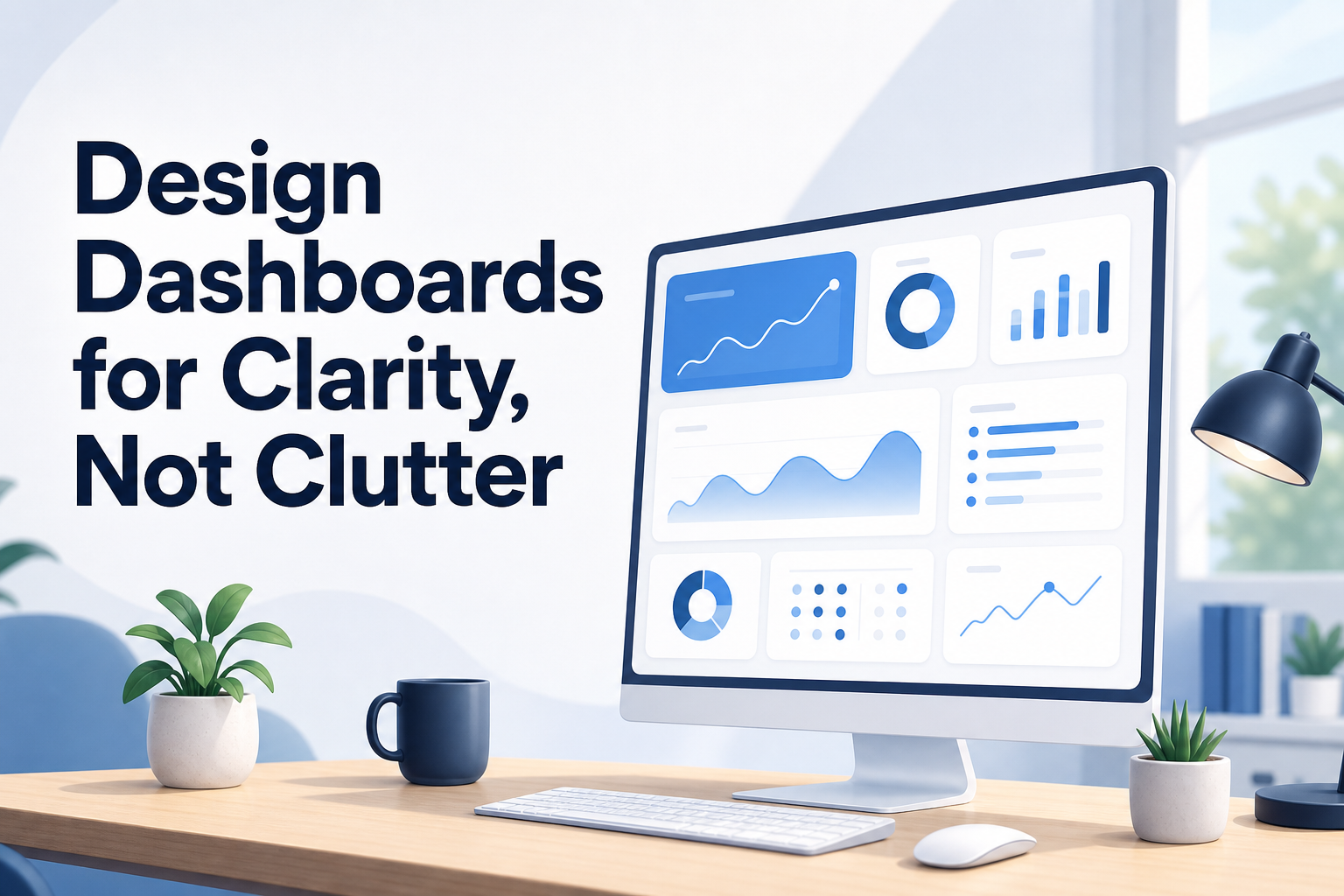
Even with the right metrics, dashboard layout makes a big difference. The simplest designs use an F-pattern: most people scan from top-left across the first row, then down the left. Put your main KPI in the top-left, with the next most important across the row.
Don’t fill every inch with charts. Whitespace is your friend—it makes dashboards easier to read and less overwhelming. If a metric isn’t essential to the dashboard’s core question, leave it out or put it on a different tab.
Use color-coding sparingly and purposefully. Red can flag churn spikes, green can signal MRR growth, but don’t color everything just for looks. Compact, focused dashboards get used and trusted far more than cluttered ones.
Build a Habit: Review, Adjust, Improve
Nailing your saas subscription dashboard metrics selection isn’t a one-and-done task. As your business grows and shifts, so will the questions you need to answer and the numbers that matter. Review your dashboards regularly—monthly for revenue and retention, quarterly for efficiency and ROI. Refresh definitions, check that your data sources are still solid, and don’t be afraid to drop a metric if it’s no longer useful.
Involve your whole team so each role gets the numbers that really matter, not just what’s easiest to pull. And always start with the same question: what decision do we need to make today? Dashboards built this way become tools you rely on, not digital junk drawers. You’ll spend less time debating numbers and more time actually growing your company.

I’m Omar Khalil, and I’ve spent the past decade working within the MEA technology channel ecosystem, from distribution in Dubai to partner enablement across Africa. I write about practical strategies for vendors, distributors, and resellers navigating the unique challenges of selling technology solutions in the Middle East and Africa. My focus is on actionable intelligence drawn from real market experiences, not generic theory. When I’m not writing, I’m usually at a channel event somewhere between Riyadh and Read the full About the author page.


![How to Choose the Right SaaS Subscription Model for Channel Partners [2026 Guide]](https://techchannelmea.com/wp-content/uploads/2026/07/how-to-choose-the-right-saas-subscription-model-for-channel-partners-2026-guide.png)